Creating 3D-printable business cards with React Three Fiber
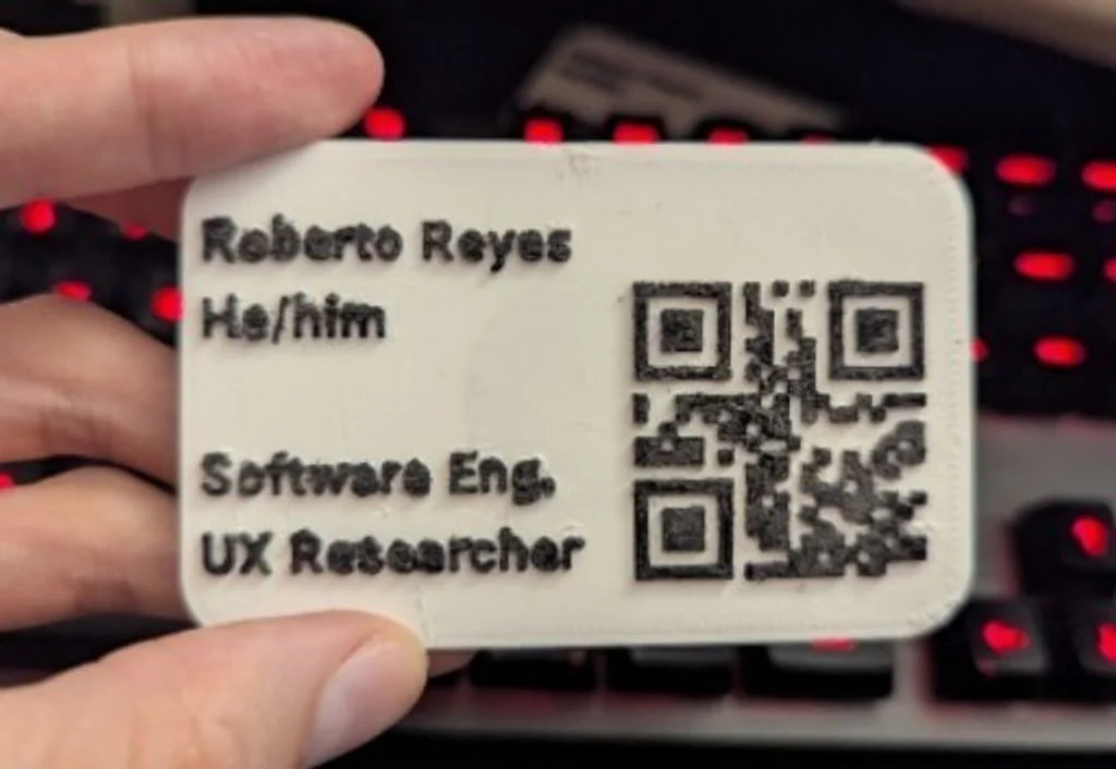
Recently, I've been looking into ways in which we can connect both the web and the physical world. As a web engineer who sometimes does IoT-related projects, such as a lamp that changes colours when you send a message to a Bluesky account, I know that using microcontrollers is a common approach for this. And, of course, this can be great fun, both to develop and use! But, what about creating new things instead of just connecting to existing ones?
In this guide, we'll explore how to create an app that can make business cards which can be customised and 3d printed. We go from scratch: starting with a design and setting up the project, creating its UI using DaisyUI, adding all the interactive elements, and then creating the body and elements of the business card with React Three Fiber. Finally, we connect everything through a Zustand store to let us download the model.
Let's get started!
Notes:
- This guide assumes that you already know how to use React and have a notion of how Tailwind works.
- Some code blocks include comments to make it easier to understand and follow what's going on in them.
- The code of the UI was partially created using Claude. The design and React Three Fiber sections of the code were done by hand.
What we will create
Throughout this guide we will be making the following app, which you can also try here:
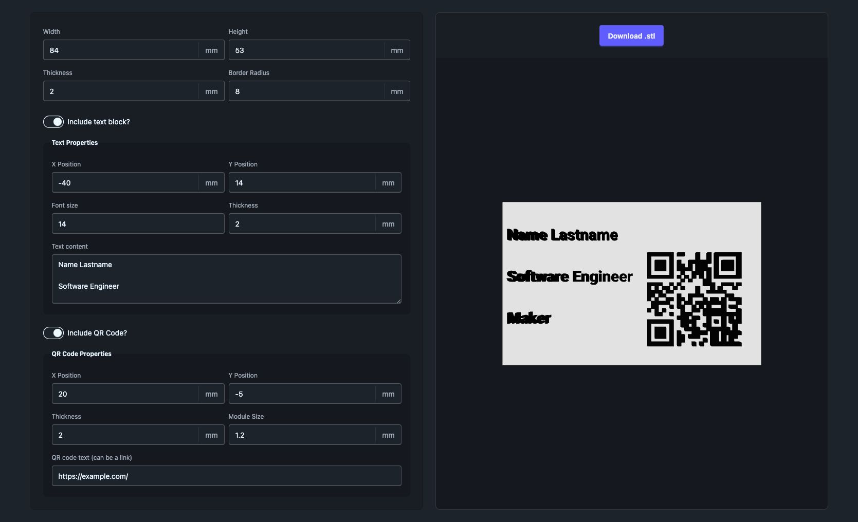
It will consist of two parts:
- The left part will contain a form that controls all the different properties that will make up our model: positions, widths, heights, contents of text and QR code, etc.
- The right part will contain a 3d preview of the business card model and a download button for the result. Using the button, we'll be able to download the model as a
.stlfile, one of the standards for 3d printing.
As for the technologies we'll be using, we'll control the shared state of our application through Zustand, use DaisyUI for the User Interface, generate QR codes with node-qrcode, and React Three Fiber to create our models. For this guide, we will be packing everything into a Next.js application, but this can be done with any other React-based framework as we won't be using any Next.js-specific features. Additionally, you can use the final repository for guidance if you need some support.
Project setup
Let's start the development of this project by setting up our dev environment. For this first step you have two options: you can download the starting repo, which is part of the full repository, or follow the manual setup steps described below. If you decide to go for the first option, make sure you are using it in its initial status, the one labelled with the initial-commit tag.
Manual Setup
Packages installation
To prepare our files for the project we will need to create the Next.js app we will be using, install our dependencies, and set up some files. We can do the first two steps by using the following commands:
# Create a Next.js app
npx create-next-app@latest rtf-cards --empty --use-npm --ts --tailwind --react-compiler --eslint --app --src-dir --yes
cd rtf-cards

# Install our dependencies. This is all one single line.
npm i @react-three/csg @react-three/drei @react-three/fiber qrcode daisyui  zustand three @tailwindcss/postcss

# Install qrcode types
npm i -D @types/qrcode
Adding DaisyUI's config
Now, let's configure our project so DaisyUI's styles are added properly. Add a postcss.config.mjs file into the root of your project and paste the following content in it:
/** @type {import('postcss-load-config').Config} */
const config = {
  plugins: {
    '@tailwindcss/postcss': {},
  },
};
export default config;
Next, make sure your app/global.css looks like this:
@import "tailwindcss";

/* Add this line */
@plugin "daisyui";
Note: If you would like to add any custom theming using DaisyUI so your app looks just how you want it, you can do so in this file! Check out DaisyUI's Theme Generator to personalise the look and feel of your app.
Now we're ready to start creating our UI! You can start the app by using npm run dev in the root folder of your project.
Creating the UI for the form
The form will be the source of truth for our application. It will control the model, its texts, dimensions, and every other part of it. On its side, the 3d scene will only have to read the form's values to generate and render the final model.
Let's start by creating our types and configuring the default values of the application. For this, we'll create a src/types/cardFormTypes.ts in our project, where we will add the following:
export interface CardDimensions {
  width: number;
  height: number;
  thickness: number;
}

export interface TextBlockState {
  enabled: boolean;
  xPosition: number;
  yPosition: number;
  thickness: number;
  fontSize: number;
  content: string;
}

export interface QrCodeState {
  enabled: boolean;
  xPosition: number;
  yPosition: number;
  thickness: number;
  moduleSize: number;
  qrContent: string;
}

/** Shape of the whole card form. */
export interface CardFormState {
  card: CardDimensions;
  textBlock: TextBlockState;
  qrCode: QrCodeState;
}

export const initialCardFormState: CardFormState = {
  card: { width: 84, height: 53, thickness: 1 },
  textBlock: {
    enabled: true,
    xPosition: -40,
    yPosition: 14,
    thickness: 1,
    fontSize: 14,
    content: "Name Lastname\n\nSoftware Engineer\n\nMaker",
  },
  qrCode: {
    enabled: true,
    xPosition: 20,
    yPosition: -5,
    thickness: 1,
    moduleSize: 1.2,
    qrContent: "https://example.com/",
  },
};
The 84 by 53 represent something close to the standard size of a card in mm. Although the standard size is closer to 85.6 x 53.98 mm, making it a bit smaller will give us a bit of leeway for the card to fit in a wallet without issues due to its thickness. In addition, the application will always start with something realistic whenever a new user tries it out.
We'll save these as initial values in a Zustand store. This store will include not only these values, but also several functions that will help us manage them to make our life easier later. In the code below, note how we're creating this store and wrapping it in persist, which will save the values to localStorage so they are constantly saved after any changes happen. Additionally, the merge function fills in all the values that a returning visitor's saved data doesn't have.
Add the following content in src/stores/formStore.ts:
import { create } from "zustand";
import { persist } from "zustand/middleware";
import type { CardFormState } from "@/types/cardFormTypes";
import { initialCardFormState } from "@/types/cardFormTypes";

interface FormStateStore {
  form: CardFormState;
  setForm: (form: CardFormState) => void;
}

export const FORM_STATE_STORAGE_KEY = "formState";

/**
 * Merges a persisted form over the defaults, group by group, so fields added
 * in later versions still get their default value for returning users.
 */
export function mergePersistedForm(persisted: unknown): CardFormState {
  const saved = (persisted as { form?: Partial<CardFormState> } | null)?.form;
  if (!saved || typeof saved !== "object") return initialCardFormState;
  const d = initialCardFormState;
  return {
    card: { ...d.card, ...saved.card },
    textBlock: { ...d.textBlock, ...saved.textBlock },
    qrCode: { ...d.qrCode, ...saved.qrCode },
  };
}

const useFormStateStore = create<FormStateStore>()(
  persist(
    (set) => ({
      form: initialCardFormState,
      setForm: (form) => set({ form }),
    }),
    {
      name: FORM_STATE_STORAGE_KEY,
      partialize: (s) => ({ form: s.form }),
      merge: (persisted, current) => ({
        ...current,
        form: mergePersistedForm(persisted),
      }),
      skipHydration: true,
    },
  ),
);

export default useFormStateStore;
If you, like me, are using Next.js, we need to ensure that the first render is done without access to localStorage. This is to avoid any mismatches that could happen between the server and the client. For this, we're using the following component on src/components/FormStateHydrator.tsx:
"use client";

import { useEffect } from "react";
import useFormStateStore from "@/stores/formStore";

/** Restores the saved form from localStorage once mounted in the browser. */
export function FormStateHydrator() {
  useEffect(() => {
    void useFormStateStore.persist.rehydrate();
  }, []);
  return null;
}
Next up is the form. For this, we'll create a series of small, reusable components that will make up our inputs. We'll be using some custom implementations to make them look exactly how we want while keeping their standard HTML behaviour. Add the following under src/components/FormInputs.tsx:
"use client";

import { useId, useState } from "react";
import type { ReactNode } from "react";

interface FieldShellProps {
  label: string;
  htmlFor: string;
  className?: string;
  children: ReactNode;
}

function FieldShell({ label, htmlFor, className, children }: FieldShellProps) {
  return (
    <div className={`fieldset min-w-0 ${className ?? ""}`}>
      <label htmlFor={htmlFor} className="label">
        {label}
      </label>
      {children}
    </div>
  );
}

export interface NumberFieldProps {
  label: string;
  value: number;
  onValueChange: (value: number) => void;
  unit?: string;
  className?: string;
}

const STEP = 1;
const SHIFT_STEP = 10;

/** What the field accepts while typing: optional minus sign, digits, one point. */
const NUMERIC_DRAFT = /^-?\d*\.?\d*$/;

function parseDraft(draft: string): number {
  return /^-?\.?$/.test(draft) ? 0 : Number(draft);
}

/**
 * Controlled number input with a trailing unit.
 *
 * Keeps the text being typed in a local draft: a controlled `type="number"`
 * input would re-render "1." as "1" and drop the decimal point before the
 * user can type the fractional digits. Both "." and "," work as the decimal
 * separator; the parsed number is reported through `onValueChange`.
 *
 * Being a text input, it restores the number-input behavior by hand
 * (WAI-ARIA spinbutton pattern): `role="spinbutton"` with `aria-valuenow`,
 * and ArrowUp / ArrowDown step by 1 (10 with Shift).
 */
export function NumberField({
  label,
  value,
  onValueChange,
  unit = "mm",
  className,
}: NumberFieldProps) {
  const id = useId();
  const [draft, setDraft] = useState(String(value));

  // The value changed from outside (e.g. restored form state): show it.
  if (parseDraft(draft) !== value) {
    setDraft(String(value));
  }

  function commit(nextDraft: string) {
    setDraft(nextDraft);
    onValueChange(parseDraft(nextDraft));
  }

  return (
    <FieldShell label={label} htmlFor={id} className={className}>
      <label className="input w-full">
        <input
          id={id}
          type="text"
          role="spinbutton"
          aria-valuenow={value}
          inputMode="decimal"
          value={draft}
          onKeyDown={(e) => {
            if (e.key !== "ArrowUp" && e.key !== "ArrowDown") return;
            e.preventDefault();

            const step = e.shiftKey ? SHIFT_STEP : STEP;
            const delta = e.key === "ArrowUp" ? step : -step;
            // Round away float noise
            commit(String(Math.round((value + delta) * 1e10) / 1e10));
          }}
          onChange={(e) => {
            const next = e.target.value.replace(",", ".");
            if (!NUMERIC_DRAFT.test(next)) return;

            commit(next);
          }}
        />
        {unit && <span className="label">{unit}</span>}
      </label>
    </FieldShell>
  );
}

export interface TextFieldProps {
  label: string;
  value: string;
  onValueChange: (value: string) => void;
  placeholder?: string;
  className?: string;
}

export function TextField({
  label,
  value,
  onValueChange,
  placeholder,
  className,
}: TextFieldProps) {
  const id = useId();
  return (
    <FieldShell label={label} htmlFor={id} className={className}>
      <input
        id={id}
        type="text"
        className="input w-full"
        value={value}
        placeholder={placeholder}
        onChange={(e) => onValueChange(e.target.value)}
      />
    </FieldShell>
  );
}

export interface TextAreaFieldProps {
  label: string;
  value: string;
  onValueChange: (value: string) => void;
  className?: string;
}

export function TextAreaField({
  label,
  value,
  onValueChange,
  className,
}: TextAreaFieldProps) {
  const id = useId();
  return (
    <FieldShell label={label} htmlFor={id} className={className}>
      <textarea
        id={id}
        className="textarea h-24 w-full"
        value={value}
        onChange={(e) => onValueChange(e.target.value)}
      />
    </FieldShell>
  );
}
For the sections that can be hidden, we use a small wrapper around a fieldset. When the switch that controls these sections is off, the fieldset gets disabled and hidden, so the corresponding section disappears. Create the following component on src/components/PropertyGroup.tsx:
"use client";

import type { ReactNode } from "react";

export interface PropertyGroupProps {
  label: string;
  legend: string;
  children?: ReactNode;
  checked: boolean;
  onToggleChange: (checked: boolean) => void;
  className?: string;
}

/**
 * A DaisyUI toggle with a label, controlling a fieldset of input fields.
 * While the toggle is off the fieldset is disabled and hidden.
 */
export function PropertyGroup({
  label,
  legend,
  children,
  checked,
  onToggleChange,
  className,
}: PropertyGroupProps) {
  return (
    <div className={`flex flex-col gap-3 ${className ?? ""}`}>
      <label className="flex cursor-pointer items-center gap-2 text-sm">
        <input
          type="checkbox"
          role="switch"
          className="toggle"
          checked={checked}
          onChange={(event) => onToggleChange(event.target.checked)}
        />
        <span>{label}</span>
      </label>
      <fieldset
        disabled={!checked}
        hidden={!checked}
        className="fieldset bg-base-300 border-base-300 rounded-box border p-4"
      >
        <legend className="fieldset-legend">{legend}</legend>
        {children}
      </fieldset>
    </div>
  );
}
And, finally, the form that ties it all together. To make sure that all the fields read only from a single group, we create and use a helper with all the different inputs of the form. Add this onto a new src/components/CardForm.tsx file:
"use client";

import { NumberField, TextAreaField, TextField } from "./FormInputs";
import { PropertyGroup } from "./PropertyGroup";
import useFormStateStore from "@/stores/formStore";

export interface CardFormProps {
  className?: string;
}

const GRID = "grid grid-cols-1 gap-x-2 gap-y-2 md:grid-cols-2";

export function CardForm({ className }: CardFormProps) {
  const state = useFormStateStore((s) => s.form);
  const onChange = useFormStateStore((s) => s.setForm);
  const { card, textBlock, qrCode } = state;

  const setCard = (patch: Partial<typeof card>) =>
    onChange({ ...state, card: { ...card, ...patch } });
  const setText = (patch: Partial<typeof textBlock>) =>
    onChange({ ...state, textBlock: { ...textBlock, ...patch } });
  const setQr = (patch: Partial<typeof qrCode>) =>
    onChange({ ...state, qrCode: { ...qrCode, ...patch } });

  return (
    <form
      className={`bg-base-200 border-base-300 rounded-box flex flex-col gap-6 border p-6 ${className ?? ""}`}
      onSubmit={(e) => e.preventDefault()}
    >
      <fieldset className={GRID}>
        <legend className="sr-only">Card</legend>
        <NumberField
          label="Width"
          value={card.width}
          onValueChange={(width) => setCard({ width })}
        />
        <NumberField
          label="Height"
          value={card.height}
          onValueChange={(height) => setCard({ height })}
        />
        <NumberField
          label="Thickness"
          value={card.thickness}
          onValueChange={(thickness) => setCard({ thickness })}
        />
      </fieldset>

      <PropertyGroup
        label="Include text block?"
        legend="Text Properties"
        checked={textBlock.enabled}
        onToggleChange={(enabled) => setText({ enabled })}
      >
        <div className={GRID}>
          <NumberField
            label="X Position"
            value={textBlock.xPosition}
            onValueChange={(xPosition) => setText({ xPosition })}
          />
          <NumberField
            label="Y Position"
            value={textBlock.yPosition}
            onValueChange={(yPosition) => setText({ yPosition })}
          />
          <NumberField
            label="Font size"
            unit=""
            value={textBlock.fontSize}
            onValueChange={(fontSize) => setText({ fontSize })}
          />
          <NumberField
            label="Thickness"
            value={textBlock.thickness}
            onValueChange={(thickness) => setText({ thickness })}
          />
          <TextAreaField
            className="md:col-span-2"
            label="Text content"
            value={textBlock.content}
            onValueChange={(content) => setText({ content })}
          />
        </div>
      </PropertyGroup>

      <PropertyGroup
        label="Include QR Code?"
        legend="QR Code Properties"
        checked={qrCode.enabled}
        onToggleChange={(enabled) => setQr({ enabled })}
      >
        <div className={GRID}>
          <NumberField
            label="X Position"
            value={qrCode.xPosition}
            onValueChange={(xPosition) => setQr({ xPosition })}
          />
          <NumberField
            label="Y Position"
            value={qrCode.yPosition}
            onValueChange={(yPosition) => setQr({ yPosition })}
          />
          <NumberField
            label="Thickness"
            value={qrCode.thickness}
            onValueChange={(thickness) => setQr({ thickness })}
          />
          <NumberField
            label="Module Size"
            value={qrCode.moduleSize}
            onValueChange={(moduleSize) => setQr({ moduleSize })}
          />
          <TextField
            className="md:col-span-2"
            label="QR code text (can be a link)"
            placeholder="https://example.com/"
            value={qrCode.qrContent}
            onValueChange={(qrContent) => setQr({ qrContent })}
          />
        </div>
      </PropertyGroup>
    </form>
  );
}
Let's add all of these elements into our page by modifying our homepage on src/app/page.tsx. We can add a layout, and prepare the rest of the app for all the components we'll be creating:
"use client";

import RTFContainer from "@/components/3d/RTFContainer";
import { CardForm } from "@/components/CardForm";
import { Visualizer } from "@/components/Visualizer";
import { FormStateHydrator } from "@/stores/FormStateHydrator";

export default function Home() {
  return (
    <div>
      <FormStateHydrator />
      <main className="bg-base-100 mx-auto flex min-h-screen w-full max-w-[1600px] flex-col gap-6 px-4 py-6 lg:px-6">
        <div className="grid min-h-0 flex-1 grid-cols-1 gap-6 lg:grid-cols-2">
          <CardForm />
          <div>Our 3d visualizer will go here!</div>
        </div>
      </main>
    </div>
  );
}
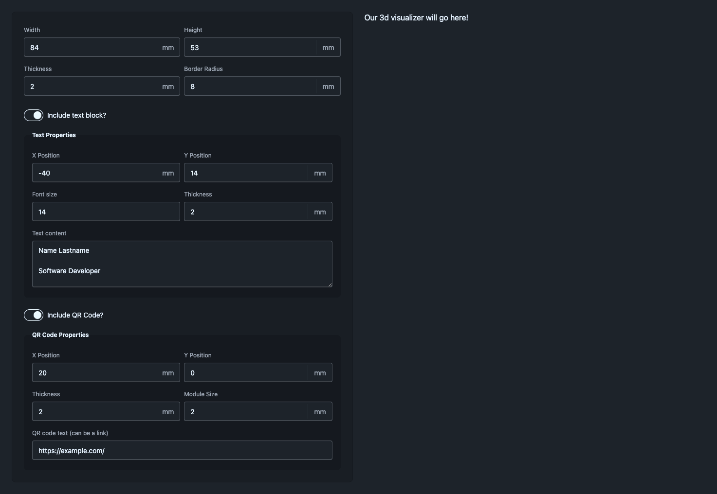
Once you have added this content, your application should look like this:
Setting up the 3d space
Let's now get to the most fun part of the project: the 3d space and its objects. For this part, we can use React Three Fiber, as it lets us create 3d objects using React's jsx syntax.
We'll start by both creating a Canvas object for our 3d space and adding Drei's OrbitControls to handle camera movement, panning, and zoom. In a new file called src/components/RTFContainer.tsx add the following:
"use client";

import { OrbitControls } from "@react-three/drei";
import { Canvas } from "@react-three/fiber";

const RTFContainer = () => {
  return (
    <div className="h-full w-full bg-white/10">
      <Canvas camera={{ position: [0, 0, 100], fov: 70 }}>
        <OrbitControls makeDefault />
        <directionalLight color="white" position={[0, 0, 5]} />
      </Canvas>
    </div>
  );
};

export default RTFContainer;
Here, we're doing three things:
- We're adding a camera and positioning it 100 units away from the centre of our 3d scene
- We're adding a set of controls to move the camera around the scene and setting them as the default using
makeDefault - And we're adding illumination to the scene, so we can actually see the objects in it once we have them
Next, let's add this scene into our page. For this, we can modify page.tsx like we did previously and replace our placeholder div with the following:
"use client";

import { CardForm } from "@/components/CardForm";
import { FormStateHydrator } from "@/components/FormStateHydrator";
// Add this import:
import RTFContainer from "@/components/RTFContainer";

export default function Home() {
  return (
    <div>
      <FormStateHydrator />
      <main className="bg-base-100 mx-auto flex min-h-screen w-full max-w-[1600px] flex-col gap-6 px-4 py-6 lg:px-6">
        <div className="grid min-h-0 flex-1 grid-cols-1 gap-6 lg:grid-cols-2">
          <CardForm />
          {/* We add the following elements: */}
          <div className="bg-base-300 rounded-box flex min-h-96 flex-1 overflow-hidden border border-base-content/10 p-6">
            <RTFContainer />
          </div>
        </div>
      </main>
    </div>
  );
}
You might have noticed that we are missing the download button that was part of our initial layout. Don't worry! We haven't forgotten about it yet, we'll just add it later :)
At this point our app is ready to show all of its 3d contents. However, with no objects to show, we just see an empty canvas!
Let's now focus on creating and adding our first object: the body of the card.
Rendering the card body
To render the body of our card we'll go for the simplest 3d shape: a box! For this, we can use a box geometry that's part of the standard tools that Three.js gives us. Its center will lie at 0, 0, 0, and it will take in the height, width, and thickness props of our form. Afterwards, we'll apply a white material, so the box will be visible on screen. Do the following in src/components/CardMesh.tsx:
import type { CardDimensions } from "../cardFormTypes";

const CardMesh = ({ cardProps }: { cardProps: CardDimensions }) => {
  return (
    <mesh>
      <boxGeometry
        args={[cardProps.width, cardProps.height, cardProps.thickness]}
      />
      <meshBasicMaterial color="white" />
    </mesh>
  );
};

export default CardMesh;
And add this new component into our RTFContainer:
"use client";

import { OrbitControls } from "@react-three/drei";
import { Canvas } from "@react-three/fiber";

// We add these two new imports
import useFormStateStore from "@/stores/formStore";
import CardMesh from "./CardMesh";


const RTFContainer = () => {
  // We add this line to extract the card props from the form state
  const { card } = useFormStateStore((s) => s.form);

  return (
    <div className="h-full w-full">
      <Canvas camera={{ position: [0, 0, 100], fov: 70 }}>
        <OrbitControls makeDefault />

        <directionalLight color="white" position={[0, 0, 5]} />

        {/** And finally add this group with the card mesh */}
        <group>
          <CardMesh cardProps={card} />
        </group>
      </Canvas>
    </div>
  );
};

export default RTFContainer;
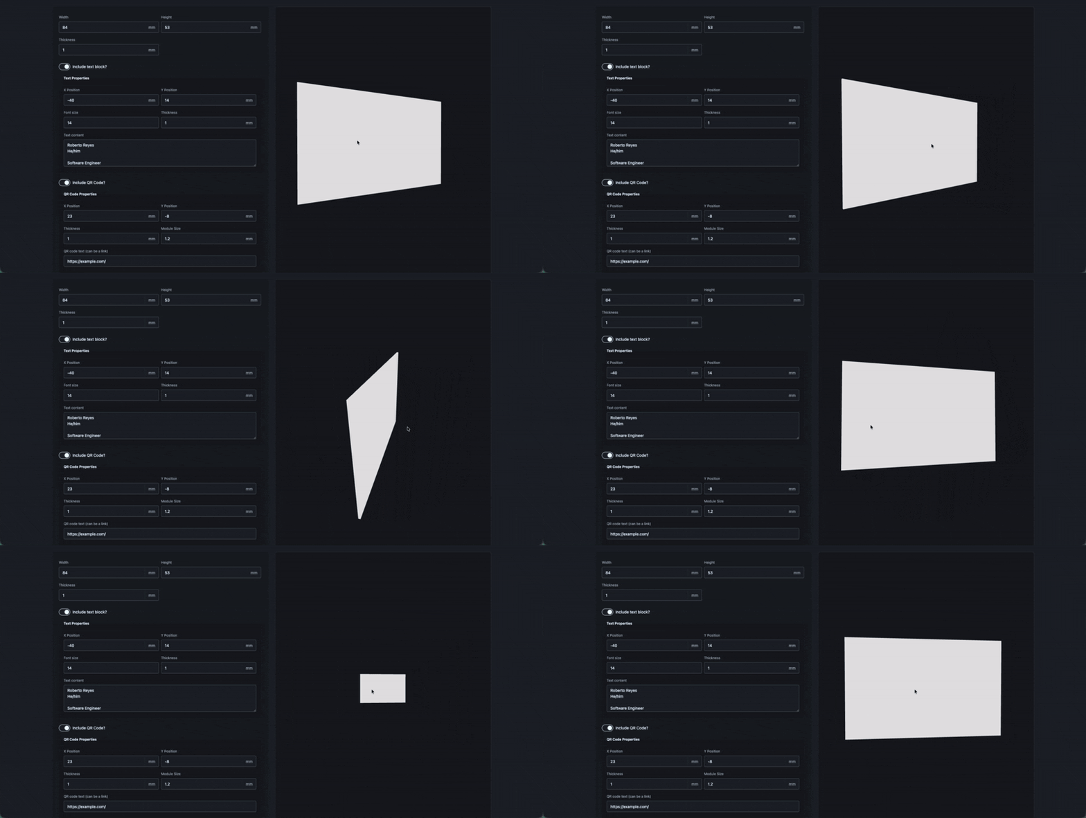
With this added, you should be able to see the first object on the canvas: a simple, white box. Because this card is connected to our Zustand store, you can even change the values present in the form to alter the size of the card in real time. And, thanks to the OrbitControls we added, we can move the camera around, even on mobile. Pretty neat, huh?
But, of course, this gives us no information whatsoever about the person that owns the card. So let's proceed by adding another element to the mix: the owner's text.
Rendering text content
We'll be drawing the text using Drei's Text3D component, which takes a typeface JSON file and manages its geometry automatically for us. For this project, I've prepared a file for Roboto Extra Bold, which you can download here from the GitHub repo. Once you have downloaded it, make sure to store it under your public assets, /public for Next.js, and call it Roboto_ExtraBold.json.
I created this file by downloading the font files from Google Fonts, picking the boldest one available, and then converting it using Facetype.js, a free, online converter you can use for these cases. You can follow this same process to customise your card even further, choosing whichever font you like.
To render the text object, let's now create a src/components/TextBlockMesh.tsx file and add the following content into it:
import { CardDimensions, TextBlockState } from "@/types/cardFormTypes";
import { Text3D } from "@react-three/drei";

// The name of the font file you added
const TEXT_FONT = "Roboto_ExtraBold.json";

const TextBlockMesh = ({
  textBlockProps,
  cardProps,
}: {
  textBlockProps: TextBlockState;
  cardProps: CardDimensions;
}) => {
  return (
    <Text3D
      font={`/${TEXT_FONT}`}
      size={textBlockProps.fontSize / 4}
      position={[
        textBlockProps.xPosition,
        textBlockProps.yPosition,
        cardProps.thickness / 2,
      ]}
      height={textBlockProps.thickness}
    >
      {textBlockProps.content}
      <meshBasicMaterial color="black" />
    </Text3D>
  );
};

export default TextBlockMesh;
If you read the code, you might have noticed a few interesting things. First, we're scaling down the size of the text by doing fontSize / 4 so it doesn't change as drastically when altering this value. This way, if you go from font size 14 to 15, its size will just slightly change, making it so you don't have to play around with decimals that much. Second, the text sits at thickness / 2 on the Z axis. While this might seem confusing, this is due to us wanting to position our text directly on the face of our card. By making it so the text is raised by half the card's thickness, we make sure it's always resting on top of the frontal face of our card.
Now, let's add it to our scene by modifying our RTFContainer:
"use client";

import { OrbitControls } from "@react-three/drei";
import { Canvas } from "@react-three/fiber";

import useFormStateStore from "@/stores/formStore";
import CardMesh from "./CardMesh";

// We add Suspense, as Text3D suspends while the font data is loading.
// You can read more about it here: https://drei.docs.pmnd.rs/abstractions/text3d
import { Suspense } from "react";
import TextBlockMesh from "./TextBlockMesh";

const RTFContainer = () => {
  // We destructure the textBlock values from the form state
  const { card, textBlock } = useFormStateStore((s) => s.form);

  return (
    <div className="h-full w-full">
      <Canvas camera={{ position: [0, 0, 100], fov: 70 }}>
        <OrbitControls makeDefault />

        <directionalLight color="white" position={[0, 0, 5]} />
        <group>
          <CardMesh cardProps={card} />

          {/** And we add the text block with Suspense without a fallback
           * and control its visibility based on form props */}
          <Suspense fallback={null}>
            {textBlock.enabled && textBlock.content.length > 0 && (
              <TextBlockMesh textBlockProps={textBlock} cardProps={card} />
            )}
          </Suspense>

        </group>
      </Canvas>
    </div>
  );
};

export default RTFContainer;
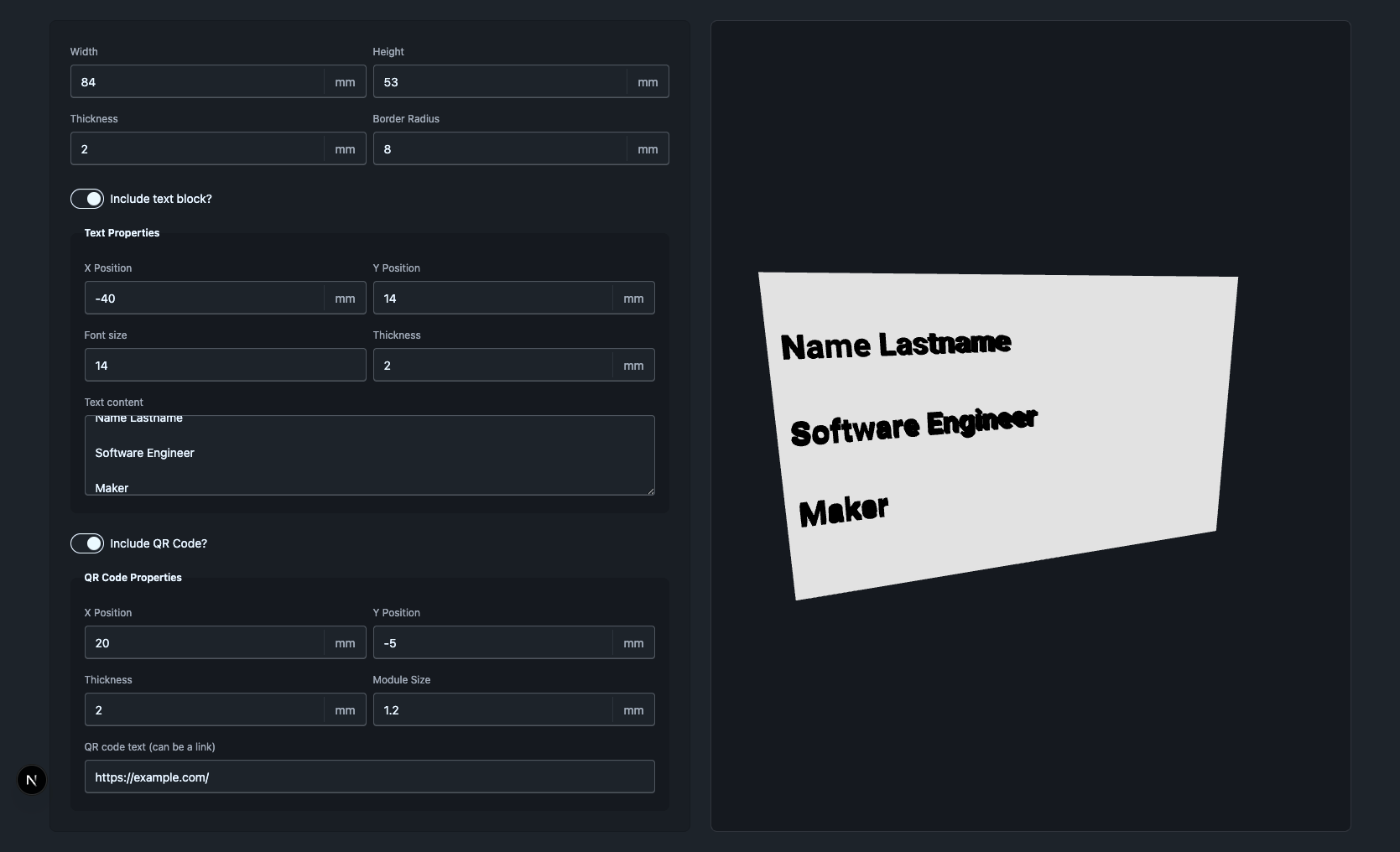
As mentioned in the code, we're controlling the visibility of our text block using the enabled prop we created for the form. If you play around with the values of the form, they should automatically be reflected into our application.
The current app should look like this:
Let's add the last element of our business card: a QR code!
Rendering the QR code
The QR code will be the most complex but fun mesh we'll create here. We'll need to start by making a matrix of 1s and 0s, representing the final result. We can use qrcode to generate this matrix, which we'll then utilise to make every individual module — the squares that make up our QR code.
Similar to the text, the QR is placed at (thickness of card + thickness of QR) / 2 on the Z axis, so it's positioned on top of the card's front face. Add the following into a new src/components/QRCodeMesh.tsx file:
import { useMemo } from "react";
import QRCode from "qrcode";
import * as THREE from "three";
import { CardDimensions, QrCodeState } from "@/types/cardFormTypes";

/**
 * We use a low level of error correction. As defined in the type, possible
 * values are L for Low, M for Medium, Q for Quartile, and H for High. A bigger
 * level of error correction will make it easier for your QR code to be scanned
 * if it gets damaged, but it will also take more space.
 */
type ErrorCorrectionType = "L" | "M" | "Q" | "H";
const ERROR_CORRECTION: ErrorCorrectionType = "L";

const makeModuleSquare = (col: number, row: number, moduleSize: number) => {
  const x = col * moduleSize;
  const y = -row * moduleSize; // flip y: matrix rows go down, 3D y goes up

  // We form the square shape for each QR code module using simple lines.
  const shape = new THREE.Shape();
  shape.moveTo(x, y);
  shape.lineTo(x + moduleSize, y);
  shape.lineTo(x + moduleSize, y + moduleSize);
  shape.lineTo(x, y + moduleSize);
  shape.closePath();
  return shape;
};

const QRCodeMesh = ({
  qrCodeProps,
  cardProps,
}: {
  qrCodeProps: QrCodeState;
  cardProps: CardDimensions;
}) => {
  // This process is quite complex, so we memoize it.
  const qrCode = useMemo(
    () =>
      QRCode.create(qrCodeProps.qrContent, {
        errorCorrectionLevel: ERROR_CORRECTION,
      }),
    [qrCodeProps.qrContent],
  );

  const geometry = useMemo(() => {
    const { size, data } = qrCode.modules;

    const shapes: THREE.Shape[] = [];
    data.forEach((value, index) => {
      if (value) {
        const yCoord = Math.floor(index / size);
        const xCoord = Math.floor(index % size);
        // Shift the grid so the QR code is centred on the origin.
        shapes.push(
          makeModuleSquare(
            xCoord - size / 2,
            yCoord + 1 - size / 2,
            qrCodeProps.moduleSize,
          ),
        );
      }
    });

    const geometry = new THREE.ExtrudeGeometry(shapes, {
      depth: qrCodeProps.thickness,
      bevelEnabled: false,
      curveSegments: 24,
    });

    geometry.center();

    return geometry;
  }, [qrCode, qrCodeProps.moduleSize, qrCodeProps.thickness]);

  return (
    <mesh
      position={[
        qrCodeProps.xPosition,
        qrCodeProps.yPosition,
        (cardProps.thickness + qrCodeProps.thickness) / 2,
      ]}
      geometry={geometry}
    >
      <meshPhongMaterial color="black" />
    </mesh>
  );
};

export default QRCodeMesh;
And, similar to our other meshes, we add the object to our RTFContainer:
"use client";

import { OrbitControls } from "@react-three/drei";
import { Canvas } from "@react-three/fiber";

import useFormStateStore from "@/stores/formStore";
import CardMesh from "./CardMesh";
import { Suspense } from "react";
import TextBlockMesh from "./TextBlockMesh";

// We import the mesh
import QRCodeMesh from "./QRCodeMesh";

const RTFContainer = () => {
  // We destructure the form values
  const { card, textBlock, qrCode } = useFormStateStore((s) => s.form);

  return (
    <div className="h-full w-full">
      <Canvas camera={{ position: [0, 0, 100], fov: 70 }}>
        <OrbitControls makeDefault />

        <directionalLight color="white" position={[0, 0, 5]} />
        <group>
          <CardMesh cardProps={card} />

          <Suspense fallback={null}>
            {textBlock.enabled && textBlock.content.length > 0 && (
              <TextBlockMesh textBlockProps={textBlock} cardProps={card} />
            )}
          </Suspense>

          {/** And add the QR Code mesh into our group similar to how we
           * did with the text block
           */}
          {qrCode.enabled && qrCode.qrContent.length > 0 && (
            <QRCodeMesh qrCodeProps={qrCode} cardProps={card} />
          )}
        </group>
      </Canvas>
    </div>
  );
};

export default RTFContainer;
With this, our app should look like this:
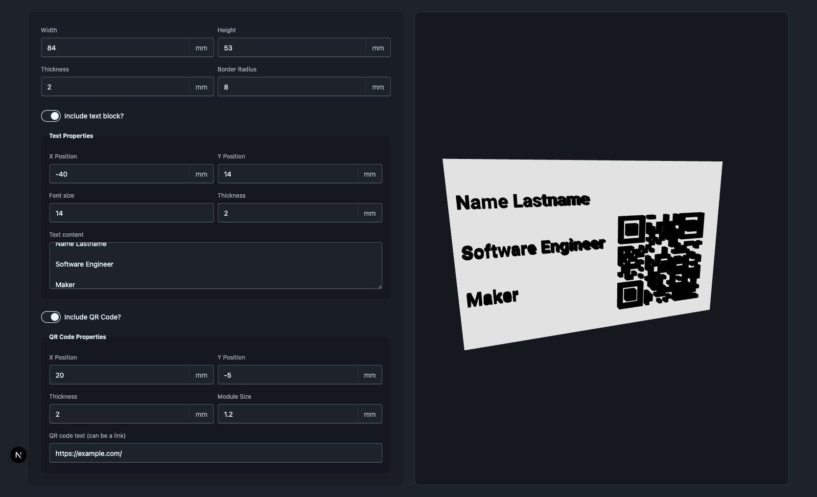
This now has almost all the elements of our original design. The only thing we're missing is a way to export the model. So, let's add that button!
Exporting our model as an STL
Now that our model is created and customisable, our last step will be to find a way to download it from the browser. Luckily, Three.js includes an STLExporter that can help us do exactly that. It exports any object that contains meshes, but it needs a way to reach the group that wraps all the models of our scene. So, to make our lives easier, we'll create a small Zustand store that will help us hold a reference to this group so we can handle the download.
To make this store, create meshStore.ts in our stores folder and add the following code:
import { create } from "zustand";
import * as THREE from "three";
import { STLExporter } from "three/examples/jsm/exporters/STLExporter.js";

interface MeshStoreState {
  jointMesh: THREE.Object3D | null;
  setJointMesh: (jointMesh: THREE.Object3D | null) => void;
  downloadModel: () => void;
}

function downloadBlobAsFile(blob: Blob, filename: string) {
  const blobUrl = URL.createObjectURL(blob);
  const link = document.createElement("a");
  link.href = blobUrl;
  link.download = filename;
  link.click();

  URL.revokeObjectURL(blobUrl);
}

const useMeshStore = create<MeshStoreState>()((set, get) => ({
  jointMesh: null,
  setJointMesh: (jointMesh) => set({ jointMesh }),

  downloadModel: () => {
    const { jointMesh } = get();
    if (!jointMesh) {
      console.error("The model is not ready yet. Try again in a moment.");
      return;
    }

    // Make sure every child's world transform is updated before exporting.
    jointMesh.updateMatrixWorld(true);

    // We convert the model to STL
    const exporter = new STLExporter();
    const data = exporter.parse(jointMesh, { binary: true });
    const blob = new Blob([data], { type: "model/stl" });

    // And we download it
    downloadBlobAsFile(blob, "joint-model.stl");
  },
}));

export default useMeshStore;
Now we just need to pass our group to the store, which we'll do by using a React ref. For this, we'll change our RTFContainer like so:
const RTFContainer = () => {
  const { card, textBlock, qrCode } = useFormStateStore((s) => s.form);
  // Add this line. Don't forget to import the store!
  const setJointMesh = useMeshStore((s) => s.setJointMesh);

  return (
    <div className="h-full w-full">
      <Canvas camera={{ position: [0, 0, 100], fov: 70 }}>
        <OrbitControls makeDefault />

        <directionalLight color="white" position={[0, 0, 5]} />

        // And make sure to connect the group with the store, here
        <group ref={setJointMesh}>

        // Rest of the code
And, finally, we'll add the download button to our page. To do this, we'll modify the layout of our page.tsx a bit and add a few elements to it:
"use client";

import { CardForm } from "@/components/CardForm";
import { FormStateHydrator } from "@/components/FormStateHydrator";
import RTFContainer from "@/components/RTFContainer";

// First, we import our mesh store
import useMeshStore from "@/stores/meshStore";

export default function Home() {
  // We then get the helper function from the mesh store
  const downloadModel = useMeshStore((s) => s.downloadModel);

  return (
    <div>
      <FormStateHydrator />
      <main className="bg-base-100 mx-auto flex min-h-screen w-full max-w-[1600px] flex-col gap-6 px-4 py-6 lg:px-6">
        <div className="grid min-h-0 flex-1 grid-cols-1 gap-6 lg:grid-cols-2">
          <CardForm />

          {/* And we change this bit, adding the download model function to our button: */}
          <div className="border-base-content/10 bg-base-300 flex flex-col overflow-hidden rounded-box border">
            <div className="bg-base-200 flex items-center justify-center p-6">
              <button
                type="button"
                onClick={downloadModel}
                className="btn btn-primary"
              >
                Download .stl
              </button>
            </div>
            <div className="flex min-h-96 flex-1 items-center justify-center p-6">
              <RTFContainer />
            </div>
          </div>
        </div>
      </main>
    </div>
  );
}
And, with that, the application is done! The final result should look like this:
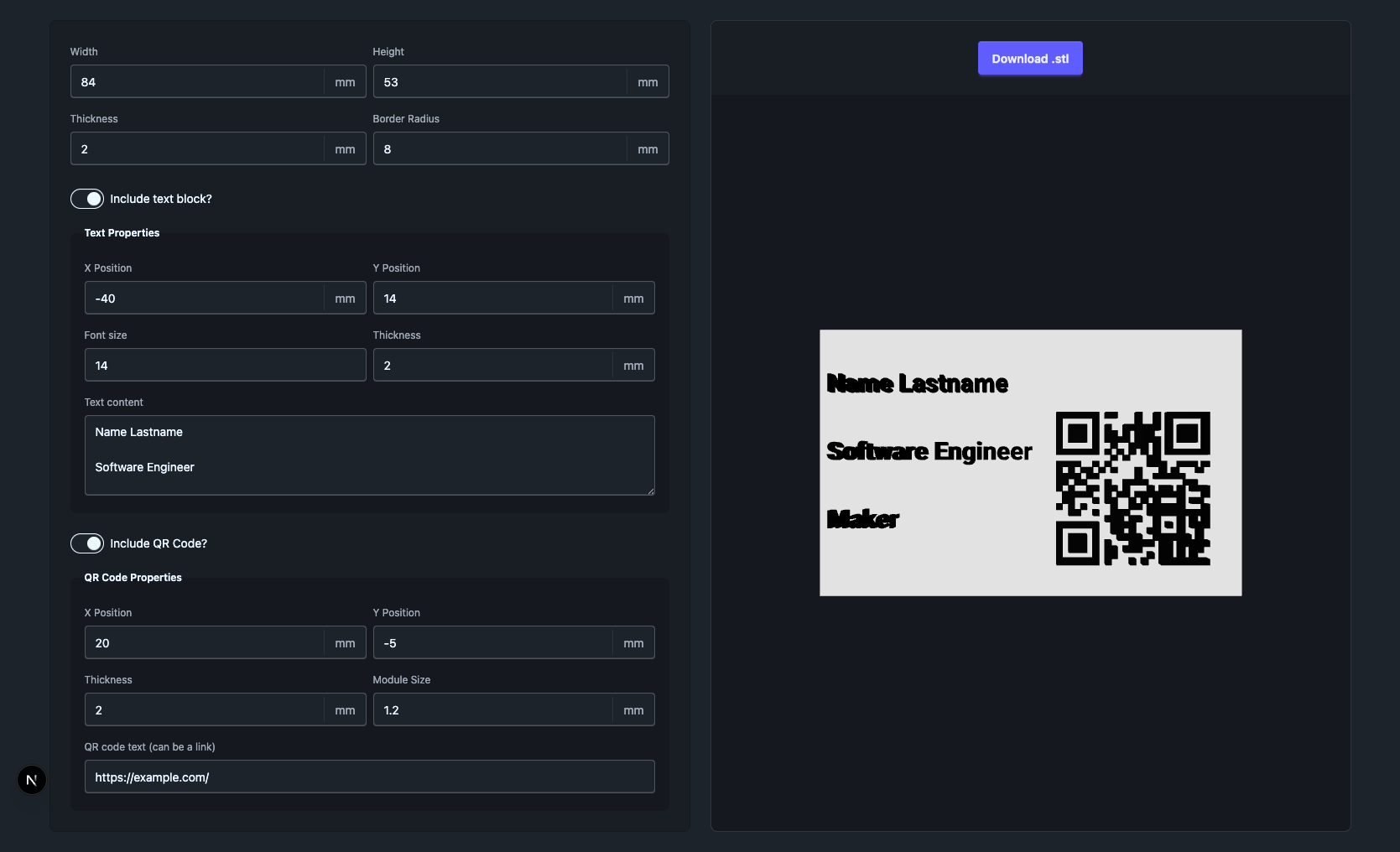
In our application, the form controls the store, which in turn controls the card 3d model. We can modify the model in real time, move it around in its 3d space, and even download the result! If you have a 3d printer, you can then print this model as a real business card and show it around. Isn't that neat?
Conclusion
As mentioned in the description, this project started as a way for me to explore ways in which we can connect the web with the physical world using 3d prints. For this, we first set up a form to control the properties of our 3d objects and then created a Zustand store to save its values. We then learned how to create a 3d space with React Three Fiber and move it around with Drei's helpers. Afterwards, we learned how to create 3d objects, give them simple textures, and position them in our 3d space. We added these objects using three different methods: standard geometries, Drei's Text3D components, and our own custom geometry. Finally, we created another Zustand store to let us download our model, and we added a download button to let our users export the final result.
While this project started as something similar to what we created here, I then decided to further expand it into a full application with some more complexity, which I decided to call g3co. Although it's still in early test versions, it allows for more customisation than what we created in this guide, and I plan to include some updates in the future to add more features and interesting parts. Moreover, it's open source! And you can find its repository on GitHub.
Apart from the exploration I wanted to do in this project and post, I wanted to use this app to learn something. See, I'm constantly looking to improve my design and development skills. For this, I figured out that creating an app about a topic that I'm already passionate about, 3d printing, was a great path to follow. And I hope you also learned some new things from it, and that you had fun while doing so.
So, if you learned something, please take what you've learned and made, and make it better!
About the author
- Hello! I'm Roberto, a Mexican Web engineer. I enjoy learning new things related to development to then share them with others 😄 You can easily find me on Bluesky: https://bsky.app/profile/robruizr.dev!
Comments
Join the discussionNo comments yet. Be the first to comment.


